Data representation in matplotlib P.1 graphs 
What are we going to do? 
- Get a large dataset from html table
- Clean the data for use
- Plot relevant table for visualization
- Styling the graphs
- Final result
Importing libraries 
For this operation we need pandas for parsing and making data tables from html and matplotlib library to plot the information. We also need numpy to manupulate the plots for styling.
import pandas as pd
import numpy as np
from matplotlib import pyplot as plt
Make a dataframe from html 
df = pd.read_html("https://www.desinventar.net/DesInventar/profiletab.jsp?countrycode=npl")[16]
We use pandas read_html function to pass a url to scrape the html table from. You can visit the website to view tables. The data we need is in the 16th table so we add [16] at last.
Let's print first 5 rows to see what we got!
df.head()
Cleaning the dataframe 
Well you can see in 1st row the unnecessary numbers as heading we want to remove those and replace with the actual headings in 0 row.
df.columns = df.iloc[0]
df.head()
Well df.iloc[0] seem to delete original heading and replace 0th row as heading by coping it. Let's remove that 0th row now. Also let us replace all NaN with zero to ease computation and representation.
df = df.reindex(df.index.drop(0))
df = df.fillna('0')
df.head()
Well that's much better!
Preparing Tables to plot 
Lets choose to plot the houses damaged and destroyed with respect to years. First we select the respective columns and get its values
house_destroyed = df['Houses Destroyed'].values
house_damaged = df['Houses Damaged'].values
year = df['Year'].values
We now take a look at the values and its datatype for first few sample items.
for value in house_destroyed[:5]:
    print(value, type(value))
As we can see they are of python strings datatype but to plot and do calculations they should be in integers because they are numerical data. Lets change their datatype and store them in list through list comprehension!
year_x = [int(i) for i in list(year)]
house_damaged_y = [int(i) for i in list(house_damaged)]
house_destroyed_y = [int(i) for i in list(house_destroyed)]
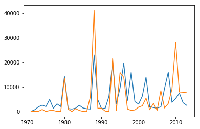
Ok. We can now pass these to matplotlib to plot a graph finally!
We use plot function in pyplot module of matplotlib which takes x axis and y axis as compulsory parameters. We will plot year in horizontal(x-axis) and house destroyed/damaged in vertical(y-axis).
plt.plot(year_x, house_destroyed_y)
plt.plot(year_x, house_damaged_y)
Styling graphs 
Adding details 
Let us first add a nice title and label and for the graph.
plt.plot(year_x, house_destroyed_y)
plt.plot(year_x, house_damaged_y)

plt.ylabel('No of houses')
plt.xlabel('Year [AD]')
plt.title('Destroyed and damaged houses')
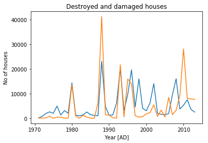
That's better. Let us now add a legend!
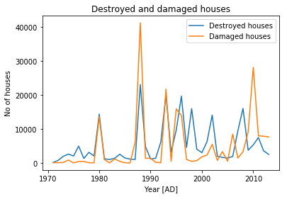
To add a legend we need to call legend() function. With legend string as params.
plt.legend(['Destroyed houses', 'Damaged houses'])
Notice, the items in the list should be in same order they were plotted in first place. This way can be little daunting when you change the order of plotting. So instead there is second option. We can pass in the label parameter while plotting and just call the legend function without any parameters.
plt.plot(year_x, house_destroyed_y, label='Destroyed houses')
plt.plot(year_x, house_damaged_y, label='Damaged houses')

plt.ylabel('No of houses')
plt.xlabel('Year [AD]')
plt.title('Destroyed and damaged houses')
plt.legend()
Adding a grid 
Well that's much better. However we can change a lot of things here. First let us add a grid to visualize the boundaries in x and y axis.
plt.plot(year_x, house_destroyed_y, label='Destroyed houses')
plt.plot(year_x, house_damaged_y, label='Damaged houses')

plt.ylabel('No of houses')
plt.xlabel('Year [AD]')
plt.title('Destroyed and damaged houses')
plt.legend()

plt.grid(True)

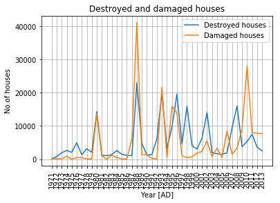
Keeping interval of 1 year and rotating markers 
Finally How about fitting all the years in 1 year interval in x-axis? Also let us rotate those years vertically. To modify those we use plt.xticks function.
plt.plot(year_x, house_destroyed_y, label='Destroyed houses')
plt.plot(year_x, house_damaged_y, label='Damaged houses')

plt.ylabel('No of houses')
plt.xlabel('Year [AD]')
plt.title('Destroyed and damaged houses')
plt.legend()

plt.xticks(np.arange(min(year_x), max(year_x)+1, 1.0))
plt.xticks(rotation=90)

plt.grid(True)
Resizing the plot 
OOPS!! Well it seems our default graph is too short in width lets increase its size. We get a current size dictionary from rcParams function and then modify it and again pass it to rcParams function to override the default with our size.
fig_size = plt.rcParams["figure.figsize"]
fig_size[0] = 12  # width is 0th item.
plt.rcParams["figure.figsize"] = fig_size
Choosing other prebuilt graph styles 
We will plot the graph in a while. Let us now choose a diffrent style for our graph. To get all available styles use
plt.style.available
Some of my favorites are ggplot, fivethirtyeight and seaborn ones. Lets use fivethirtyeight this time!
TIP: Use plt.xkcd() for getting graph that looks like drawn by hand.
plt_style = 'fivethirtyeight'
plt.style.use(plt_style)
Lets finally plot the graph yet again.
plt.plot(year_x, house_destroyed_y, label='Destroyed houses')
plt.plot(year_x, house_damaged_y, label='Damaged houses')

plt.ylabel('No of houses')
plt.xlabel('Year [AD]')
plt.title('Destroyed and damaged houses')
plt.legend()

plt.xticks(np.arange(min(year_x), max(year_x)+1, 1.0))
plt.xticks(rotation=90)

plt.grid(True)
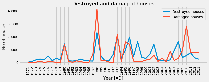
Yep that's dope!
Changing line styles and size 
We can change style and size of lines in graph as well by passing relevant parameters to plot function. Lets change the line style of damaged house to dash like (-----) and width to only 2.
plt.plot(year_x, house_destroyed_y, label='Destroyed houses')
plt.plot(year_x, house_damaged_y, linestyle='--', linewidth=2, label='Damaged houses')
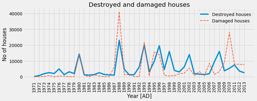
Final Result 
plt.plot(year_x, house_destroyed_y, label='Destroyed houses')
plt.plot(year_x, house_damaged_y, linestyle='--', linewidth=2, label='Damaged houses')

plt.ylabel('No of houses')
plt.xlabel('Year [AD]')
plt.title('Destroyed and damaged houses')
plt.legend()
plt.grid(True)

# managing intervals in x axis
plt.xticks(np.arange(min(year_x), max(year_x)+1, 1.0))
plt.xticks(rotation=90)

# increasing dimensions of plot
fig_size = plt.rcParams["figure.figsize"]
fig_size[0] = 12  # width is 0th item.
plt.rcParams["figure.figsize"] = fig_size

# Using other graph styles
plt_style = 'fivethirtyeight'
plt.style.use(plt_style)